I began my senior year at St. Francis High School in La Cañada Flintridge, CA, as the editor-in-chief of the school’s yearbook. Being more of a writer, and yearbooks being more visual (pictures and all), I had wanted to be on the school newspaper, which had a very clever name. Our sporting teams were called “Golden Knights,” so the paper was called the Knight Breeze. No such hilarity for the yearbook though; our publication was called Alvernian, after La Verna (Alverna in Latin), a place on Mount Penna in Tuscany in central Italy associated with St. Francis of Assisi, the patron saint of our Catholic school and founder of the Capuchin Order of priests and brothers who ran it. It was while praying at La Verna that Francis is said to have received the stigmata, the five wounds of Christ (hands, feet, side) on his body in a moment of spiritual ecstasy.
Not exactly a light-hearted, clever pun, like the boys on the newspaper had as their masthead, but you play the hand you’re dealt. The first thing you have to do when you’re putting together a yearbook is come up with a theme. I looked through the school’s annuals dating back to the 60s, and the only thing that differentiated one from another was clothing styles. I wanted Alvernian 1984 to stand out, to break from the pack, to be as memorable as that year was destined to be for us graduating seniors.

The theme I chose was that of a newspaper. The school was located roughly 13 miles northeast of Los Angeles, so the theme I chose was LA’s major newspaper, The Los Angeles Times. Mr. Klotzle, the first of my faculty “advisers” (I went through three, apparently I was very demanding and opinionated and unyielding – even then!) taught me about copyright law and the “fair use” exception, even though it was the generic format of a newspaper – articles, sections like “sports” and “classifieds” and “editorial” – I was aping; still, he and I wrote to the Times and received their permission for both the concept and the use of the font from their masthead which we printed on a mocked up paper (“Alvernian” replaced the words “Los Angeles”) that was strewn about a breakfast table with a nearly empty coffee pot and a half-eaten jelly doughnut, an homage to our publisher, Mr. Viga B. Hall, who always brought a box of jelly doughnuts to the school when meeting with me and my staff.
An image including a mocked up “Alvernian Times” was the whole cover, which was the most visual thing about the book. The various classes (frosh, sophs, juniors, seniors) were represented as “lifestyle” sections, faculty was “metro,” obviously sports was the sports section, and our sponsors in the community who helped us out financially were acknowledged in a “classified ads” section. Each of the sections began with a lot of “copy” (yearbookspeak for text), made to look as newspapery as possible. So I got my way (I usually do), and turned what is essentially a photo album into a text-heavy newspaper, with photos thrown in for good measure. It was groundbreaking and unique, a triumph of my young life if I do say so myself. And I’m pleased to tell you eds-in-chief followed suit with yearbooks at St. Francis High School in subsequent years – one that impressed me was centered on TV Guide as their thematic motif.
Now I mentioned Viga Hall, or “Vig” as we called him. It was his job as publisher to help us layout the pages, which is easier to do with pictures than with text. A picture is tangible; it has a discernable size, so you can alot space and a position on the page for it; text blocks, most of them needing to be written, were just amorphous ideas. In our meetings, Vig, and Mr. Klotzle (and Mr. Voorhees and Mr. Arigan after him) were annoyed with me as all I had for layout meetings was the “promise” of a 40 to 100-word paragraph here or a 1000-word block there. It made planning difficult.

Vig, having spent his career liaising between headstrong high school eds-in-chief, overworked and underpaid faculty advisers, typesetters, graphic artists, and his publishing company, introduced us to “lorem ipsum” – a kind of gibberish text meaning nothing – that looks like Latin and takes up space so you can design your page layouts around it. You can try it for yourself: go to this lorem ipsum generator, input the number of words, sentences, or paragraphs you want, and click on the “generate” button. Here’s what I got when I asked it for 3 sentences:
Lorem ipsum dolor sit amet consectetur adipiscing elit. Sit amet consectetur adipiscing elit quisque faucibus ex. Adipiscing elit quisque faucibus ex sapien vitae pellentesque.
This gives you something concrete on the page – placeholder text you can work with. Before & After magazine, founded by the world’s first-ever computer desktop publisher, John McWade, and the original beta test site for the computer graphics design program Aldus PageMaker, said of the ubiquitous lorem ipsum, “Its ‘words’ loosely approximate the frequency with which letters occur in English, which is why at a glance it looks pretty real.”
The truth is, it looks like Latin because it is!
Richard McClintock, a Latin scholar at Hampden-Sydney College in Virginia, gets credit for uncovering the source of what was previously thought to just be a bunch of meaningless Latin words strung together. While looking at a block of lorem ipsum, he noticed the word consectetur — and he knew he’d seen this Latin word used in a sentence with meaning. Further research led him to a passage from De Finibus Bonorum et Malorum (“On the Extremes of Good and Evil”), a first-century BCE text from the Roman philosopher Cicero, specifically sections 1.10.32–33:
Neque porro quisquam est, qui dolorem ipsum quia dolor sit amet, consectetur, adipisci velit, sed quia non numquam eius modi tempora incidunt ut labore et dolore magnam aliquam quaerat voluptatem.
Which translates to:
Nor is there anyone who loves or pursues or desires to obtain pain of itself, because it is pain, but occasionally circumstances occur in which toil and pain can procure him some great pleasure.
And that pushed me over the 1000-word threshold, my goal for these posts. So I’ll wrap up.
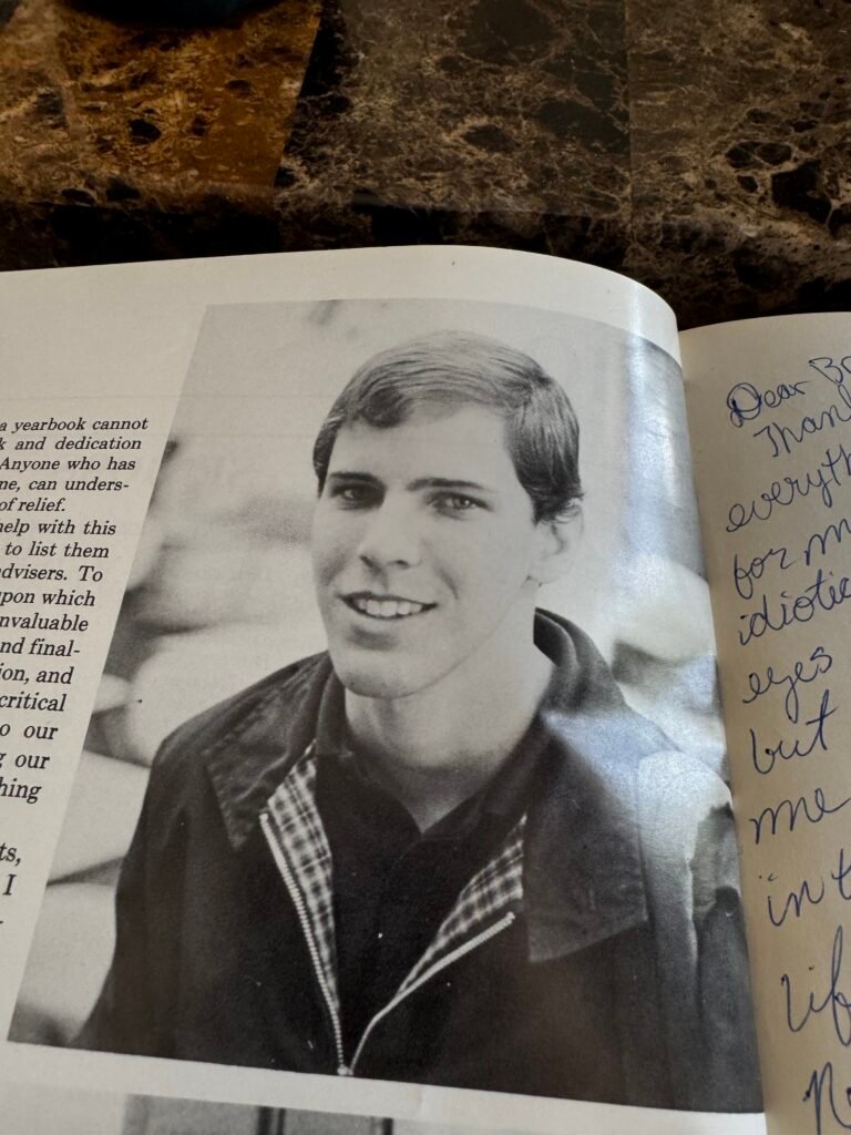
Latin is not very useful, although we put it to good use back in 1984 designing the Alvernian, whose last page (at right) featured a signoff from me and a large portrait (which I specifically included to remind myself in years to come that I did, once, have a full head of hair, as by this time it was already starting to thin and I knew I’d look back longingly 41 years later).